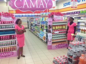
Bisola walked into Shoprite and made her way to the beverage section.
Anyone watching her movement will marvel at how she seems to know where everything is located.
She was headed for the counter when she remembers she had run out of detergent.
She meandered back to the home care section, where something seems to catch her attention.
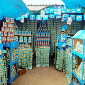
She moved closer toward her new fancy, grabs three strings of Sunlight detergent 100g from what seems like a human shelf and was slightly startled when a voice came through this shelf to say ‘thank you for using Sunlight.’
She smiled at the sudden realization that it was actually a human being acting as shelves.
She nodded in response then reached out and added more strings without minding the fact Sunlight was not her regular brand of detergent.
What then is Visual Merchandising?
Visual Merchandising is simply the art of creating and using attention grabbing product or brand displays to maximize sales. Visual Merchandising has more import for tangible products than intangibles. However, service brands can also harness some of the principles when trying to use logo, office spaces and other branded items to communicate.
Visual Merchandising is simple based on the established fact that people buy what they see. It also borrows an understanding that people want to buy and not be sold. It is believed that shoppers will pick the dominantly visible items because subconsciously they think ‘this must be what everyone is now using and if so, it must be good.’
Therefore, visual merchandising use visual stimulants to elicit positive reaction or reach the subconscious or provide some elements of convenience wherein the buyer does not have to bend low, look up or stretch their hand to the left. The more centrally convenient and dramatically the shelf display, the more store shoppers are likely to zero in on a merchandise item. For instance, studies have found that items placed conspicuously at eye level facing the main entry and/or items placed to the shoppers right at each isle turn, tend to be picked more often.
Why? Most people are right handed and human beings dislike inconvenience.
There are certain basic elements and design principles that must be thought out while planning an engaging visual merchandising: colour, lightening, landscape elevators, texture, storytellers, dominance, line, proportion, balance, repetition, rhythm, and décor. We will explore the key items among these components in detail.
Colour:
This attracts the eyes and commands an emotional response. Depending on clime, some of the most common colour associations are Red (excitement, love, passion, danger and anger); Blue (calmness, friendship, and authority); Yellow (cheerfulness, vitality, illness and warmness); Orange (affordability and casualness); Green (nature, relaxation, fruitfulness, and freedom); White (purity, peace, refinement, and coldness); and Black (manliness, mystery, power, elegance, race and luxury).
If the objective is to attract attention, the use of bright colours in merchandising displays can help it achieve its goal. Also, the plan-o-gram must create symmetry, that is, a smooth transition from one colour to another while maintaining harmony with the intended theme.
Lightening: this can be creatively used to create a strategic and attractive illumination for the outlet or around the concerned merchandise item. Lightening colour and intensity creates moods. You may consider behind-the-shelve lightening, lower level lightening for items placed below eye level, shadow-casting lightening or end-cap lightening alternatives. With a little experiment and research, almost anyone can learn to harmonize lightening with colour. Note, some lightening such as yellow alter the colour of a merchandise.

The Elevator or Landscaping:
By creating containers to the shape of your choice, you can manipulate the external form, contours, or outlines and elevate the item of merchandise on display. This is one of the reasons manufacturers invest in Point-of-sales display materials. Aside from allowing manufacturers obtain dedicated space, it also helps transform the merchandise into the shape of the container – the shape of the elevator.
Texture:
There is a difference between physical texture and visual texture. The former is a reality, the latter is an illusion and both can be incorporated to create a unique theme feel. Physical texture can be deliberately heightened by carefully selecting merchandise carriers that portray attributes such as sleek for metallic aluminum, polished wood for natural, etc . Visual texture seeks to submerge reality with surrealism where one is made to appear as another or as part of another. A customer sees a big busty smiling black woman wearing a beautiful ‘gele’ but on a closer look discovers it is in fact an illusion. The woman is a painting while the ‘gele’ or head gear is the merchandise. Notice that Bisola had mistaken a real human for a Mannequin dolly because that has been the case for long with merchandisers.
Storyteller:
Legibility and readability must be enhanced in merchandising. Merchandise items must not be placed upside down (where, for instance, the brand OMO now reads OWO) or side way or even obliterating the brand name by facing it backward. Signage also must communicate clearly. Writing can also be used to enhance the story behind the theme or give additional information. When it comes to written words, less is more.
Dominance:
People are more likely to shop at an outlet that has a larger than live appearance. They tend to believe that quality and assortment can be found in larger retail shops. In the same vein, when a particular merchandise seems to occupy everywhere, shoppers take notice and draw closer. They also want to be part of something big. As a result, creative visual merchandisers have learnt to generate traffic by building visual displays that are mammoth, gargantuan, gigantic, monumental and extensive.
While working in a modern trade for an FMCG manufacturer as Visual Trade Merchandiser, I noticed that anytime I make a massive display of this particular tea brand, the items tend to escape from the shelves in mass as soon as I place them there. I also observed that shoppers picked more of that same merchandise brand than they would have if the item had maintained same limited shelf space as competition.

Décor:
Nothing enhances your visual merchandising like planning décor into and around it. Well planned décor will shade out distractions or what I like to call visual noise. Different Sizes, varying numbers and combination of colours tell divergent stories within a certain radius of space. Aesthetically unrelated items can be built into the background of the display to create a different feel and finishing.
How does Visual Merchandising benefit your brand and why is it so important?
- Visual Merchandising is a silent salesman
- It maximizes sales by stimulating impulse buying
- It enhances customer brand experience
- It makes brand deposit in shoppers subconscious
- It increases customers traffic or footfalls
- It diverts attention from completion
Every visual merchandising campaign must have a clear cut plan-o-gram that becomes the standard for size and colour combination or transitions.
Every creative display must tell a distinctive story: pyramid, staircase, tree, football pitch, lettering, tallest, largest, dedicated shelf, hangers, etc.
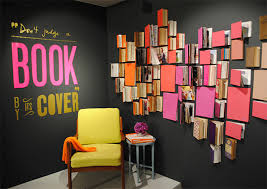
You can also borrow from unrelated items to either enhance your story or add some sort of surrealism to it.
The starting point of a good visual merchandising campaign is the development of a good plan-o-gram that defines every detail of the concept, theme, objective, target audience, tools, execution, finance, data collection and human resource requirements